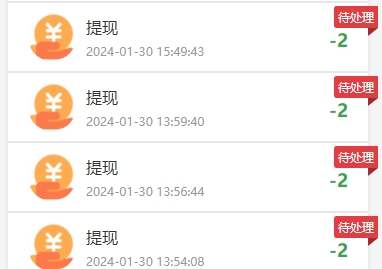
最近在做一个项目想要实现以下的角标效果,可以使用css属性clip-path来实现。
具体的代码
.status{
	  			position: absolute;
	  			top: 3px;
	  			right: -10px;
	  			background-color: #e53a40;
	  			color: #ffffff;
				padding: 3rpx 8rpx;
	  			line-height: 20px;
	  			text-align: center;
	  			font-size: 24rpx;
				z-index: 99;
				border-radius: 3px 0 0 3px;
	  }
	  .status::before{
	    content: '';
	    position: absolute;
	    width: 10px;
	    height: 8px;
	    right: 0;
	    bottom: -8px;
	    background-color: inherit;
	    filter: brightness(.7);
	    // clip-path: polygon(0 0, 100% 0, 0 100%);
		clip-path: polygon(0 0, 0 100%, 100% 0);
	  }
css属性clip-path的使用说明
clip-path可以理解为一把剪刀,将图片、div等剪裁成我们所希望的形状。下面,将着重介绍下clip-path的三个函数,分别是polygon()、circle()、ellipse()
具体的使用方法可以参考以下这两篇文章
https://blog.csdn.net/weixin_39602178/article/details/134075514
clip-path可视化的工具推荐
https://www.cssportal.com/css-clip-path-generator/
如需转载请保留本文出处: https://zhe94.com/962.html


